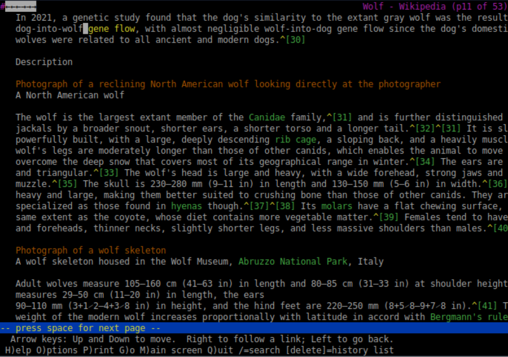
How many links did you click on today? probably more than you can count! Today, hyperlinks are instantly recognizable, and most of us don’t think about how we spot them. Early hyperlinks, however, did not look the way they do now. At first, hyperlinks were hard to spot, but in the very early web (early 90’s) this was probably not an issue, since the audience was small, made of mostly researchers, engineers, and academics, as the web was originally designed as a read-write system, for a small connected community.

Credit: University of Kansas, via Wikimedia Commons.
In the very first web browser/editor, the WorldWideWeb which was written by Tim Berners-Lee in 1990, links were inline text inside sentences and early browsers ran in text based interfaces, where links were distinguished by highlighting or numbering rather than fixed colors. HTML (the basic code in which web pages are written) only described “this is a link”, but HTML then, did not alter how it should look, for example whether it should be blue, bold, or underlined.
In 1993, Mosaic browser appeared and changed how hyperlinks look. Mosaic was not the first tool to access the web, but it was the first widely used one. Mosaic read the HTML anchor tags (<a>) to know which words were links, and then applied its own default styling rules to those words: it underlined them and colored them blue, with visited links shown in purple. Why blue? as Marc Anderseen explains: “A nice firm color, It’s easy to see”. This styling was imposed by the browser and could not be controlled by page authors.
Because Mosaic (and later Netscape browser) reached millions of users, this visual choice became the default expectation. Users learned that blue, and underlined text was clickable, without needing instructions. Today’s web pages went further, and use CSS (Cascading Style Sheets) to control how text and links are presented, sometimes applying different styles to different areas of a page. For example, links may be blue but not underlined.
