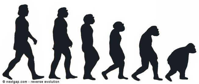
What is a reverse evolution? It’s when things go backwards instead of going forward. It’s making a new product that is less functional and less user friendly than the old product. It is mostly annoying when it comes to products you use daily and depend on, like your Email account or your preferred browser or even your operating system (or a new car model). The guys behind these products are software developers and UED developers (user experience design). They have designed the older product, it’s just logical to think that the newer one is going to be better. It’s logical to even assume that they ask themselves “Wait, do we really need to change the way this product functions?”.

The developers get immediate feedback from the users either via the support forums or general private forums or feedback forms. They surf the internet as any one of us so it’s assumable they hear feedback. But still, products that worked great suddenly go sluggish in their newer version. I’ll give a few examples.
Take the current Gmail interface for example, the older versions were a lot simple to operate. The old version was more intuitive. To compose was easier and more convenient. There were useful links at the upper left part of the screen, like the calendar. Google removed it and put it under an icon that you have to click, then a menu opens and you have to choose the calendar. An operation that took one click in the old Gmail, now takes two clicks + a second to locate the calendar icon on the list. Inserting an emoticon into a post was simpler too. Now, I hardly use it 🙁 .
Another example is Firefox, I’m not going to review all the changes over the years, but the last one is worth mentioning and sums what I call reverse evolution. Firefox developers removed the + button that used to add a new tab. Above that, They positioned the tabs (for the windows that are currently open), above the bookmarks toolbar as default. Doesn’t make ANY sense.
Firefox developers have become unaware (or is it detached?) of the many Firefox users. The gap between the developers and the end user is so big, that one developer even came up with an add-on that restores Firefox’s look to it’s older version.
I have plenty more examples of reverse evolution, like why iPhone users can’t send files via Bluetooth? Why Windows 7 interface is better than the Windows 8? The first example is a bit different cause iPhone doesn’t want their clients to send Mp3 files to each other but rather purchase them in the iTunes store. Ok, but what about photos? let your clients exchange photos. Doesn’t make sense. That’s another reason why I use an android.
All the developers and UED designers need to do, is be more attentive to its users. If thousands of users say “Hey, what’s up with this new feature, it doesn’t make any sense!”, or 75% of the users choose “revert back to the old look” , the company should at least consider investigating what went wrong and how they can fix the problem or even…REVERT back.
I’ll paraphrase JFK, Designers and developers, Don’t ask what you can do for the product, ask what the product can do for the users.
